How do you convince someone to spend $12 instead of $6?
Not with prettier packaging.
With believable value.
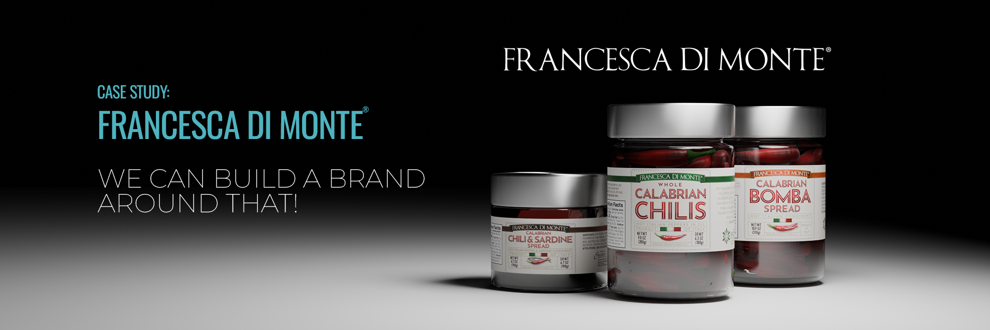
With Francesca di Monte®, offering premium products with a brand that didn't communicate that was a big problem to overcome.
Foundation
Defined the brand's premium positioning, origin story, and target customer.
Orientation
Explored multiple visual territories balancing the origin story with direct competition in the market.
Refinement
Created premium cues to the brand and label systems, reinforcing product quality.
Guidelines
Created a flexible system capable of supporting multiple imported products, in multiple package systems while maintaining a cohesive family appearance.
Equip
Delivered production-ready assets, brand standards, and packaging files ready for continued expansion.
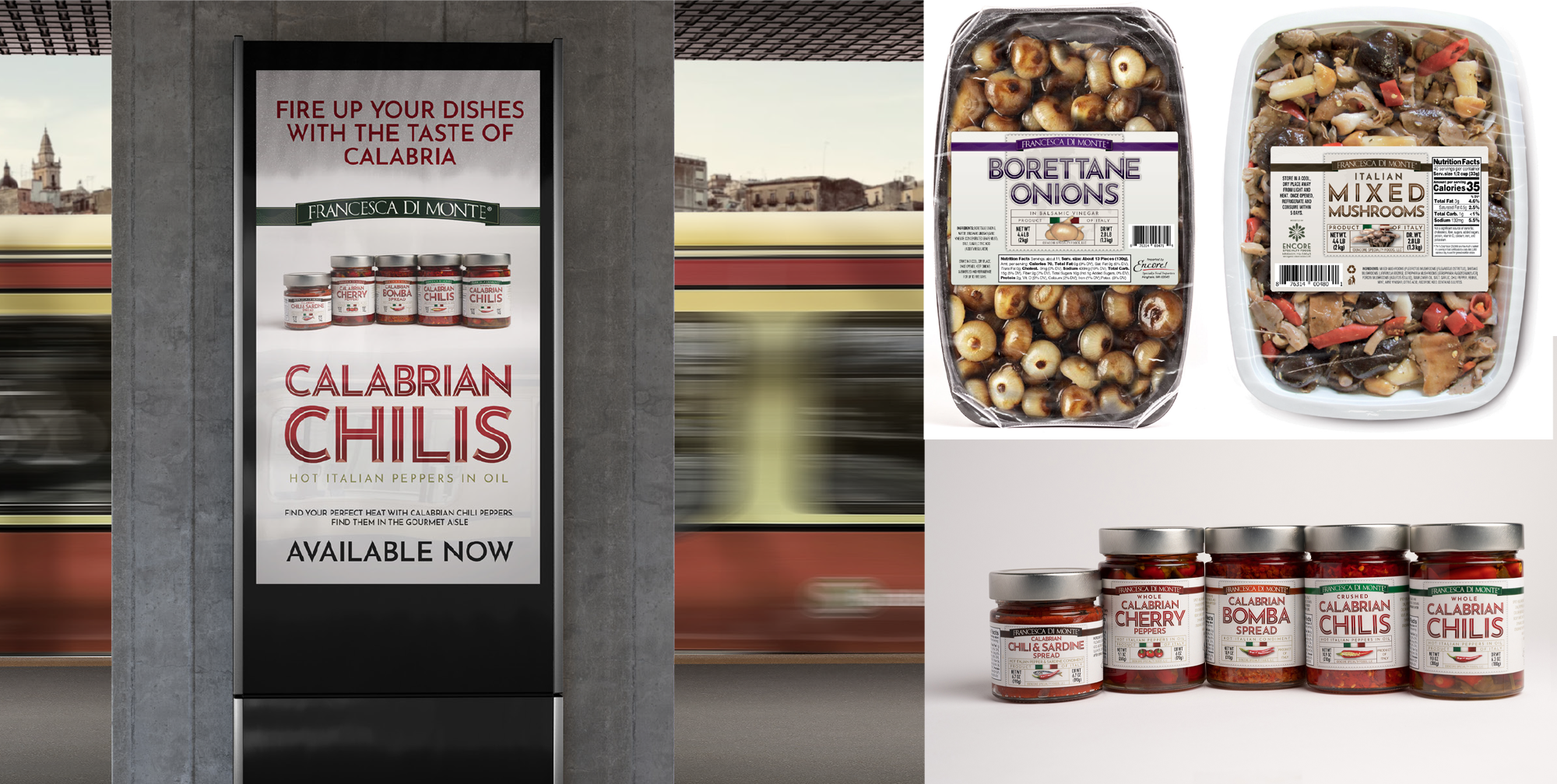
Drawing inspiration from the world of classic Italian advertising design, the rebranding process for Francesca di Monte® focused on infusing a sense of elegance and sophistication into their packaging. A bespoke alphabet was created to evoke the charm and warmth of southern Italy, adding a touch of authenticity to the brand identity. By choosing a neutral background for the packaging, the focus was shifted to the products themselves, allowing them to shine through and speak for the quality of the brand.
Successful re-brands aren't built through design alone.
They succeed when strategy, positioning, perception, and execution all reinforce one another.
That's the purpose of the FORGE Framework.
Francesca di Monte® demonstrates how thoughtful brand strategy can transform a product into a brand customers recognize, trust, and choose.